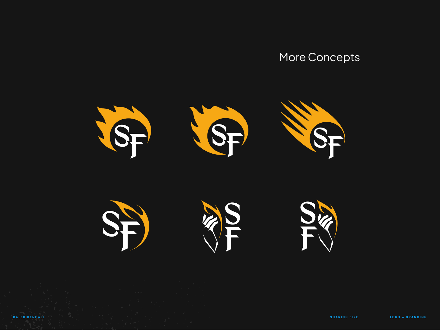
Sharing Fire

Sharing Fire Brand Development
Creative direction for a Youtube channel dedicated to sharing the warmth of good stories
Youtube creator Brandon (aka. Mindshift), peers philosophically into popular myths, stories, and traditions while sifting for the golden ideas they contain.
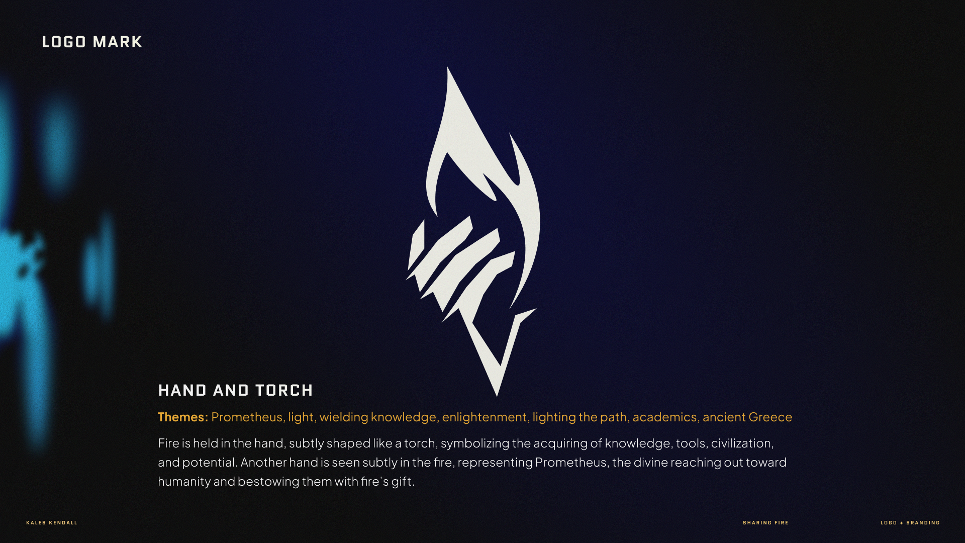
Sharing Fire (originally 'Stealing Fire') is named after the ancient Greek myth of Prometheus, the tale of a titan who defied the Olympian gods by taking fire from them and giving it to humanity, providing them with warmth, tools, and the arts. Prometheus is the channel's symbol of inspiration — for incurring Zeus's divine wrath in order to create humanity with intelligence and potential, and being unwilling to leverage ignorance. The channel's mission is to do something similar, by sharing the same inspiration with an audience to encourage wonder and curiosity, and shine a light on the knowledge available to us all.
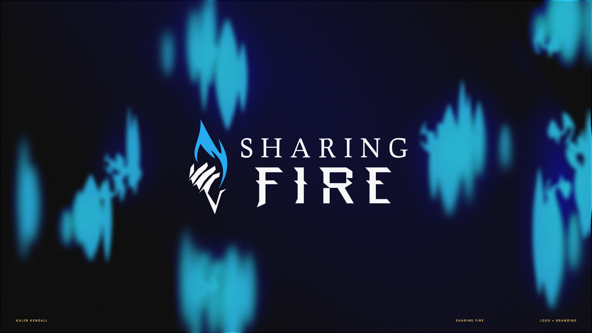
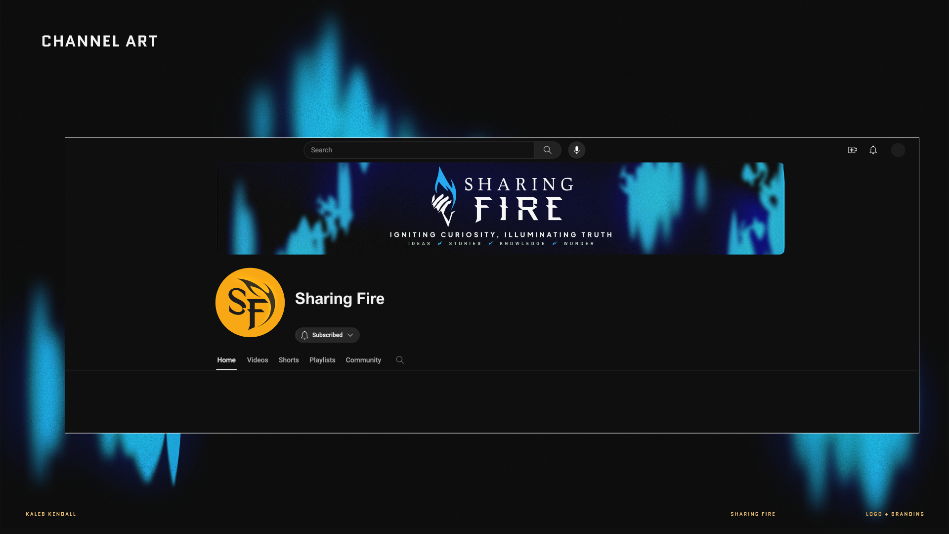
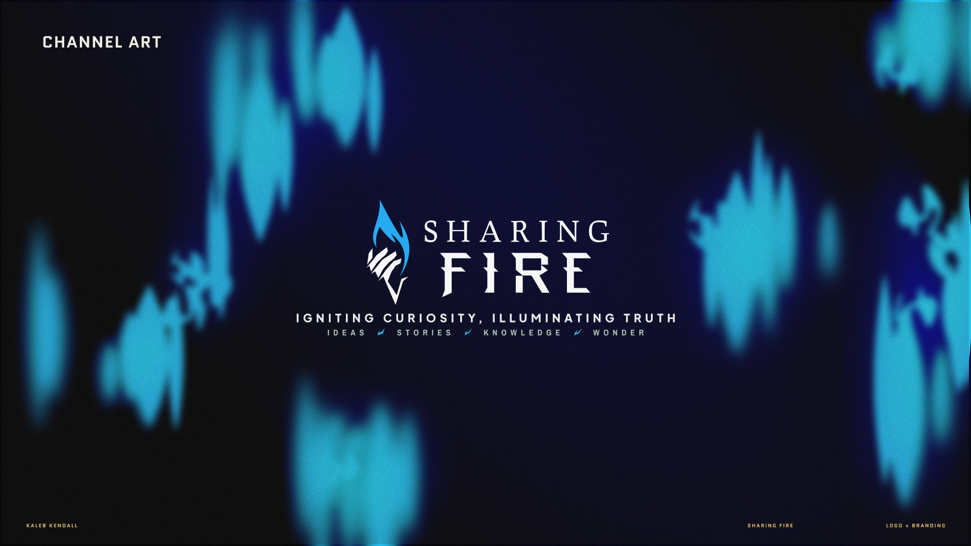
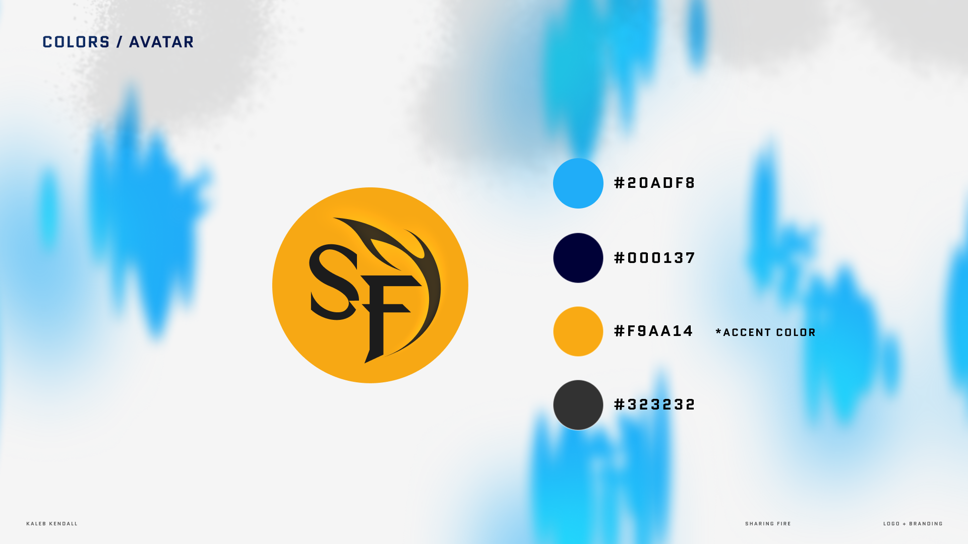
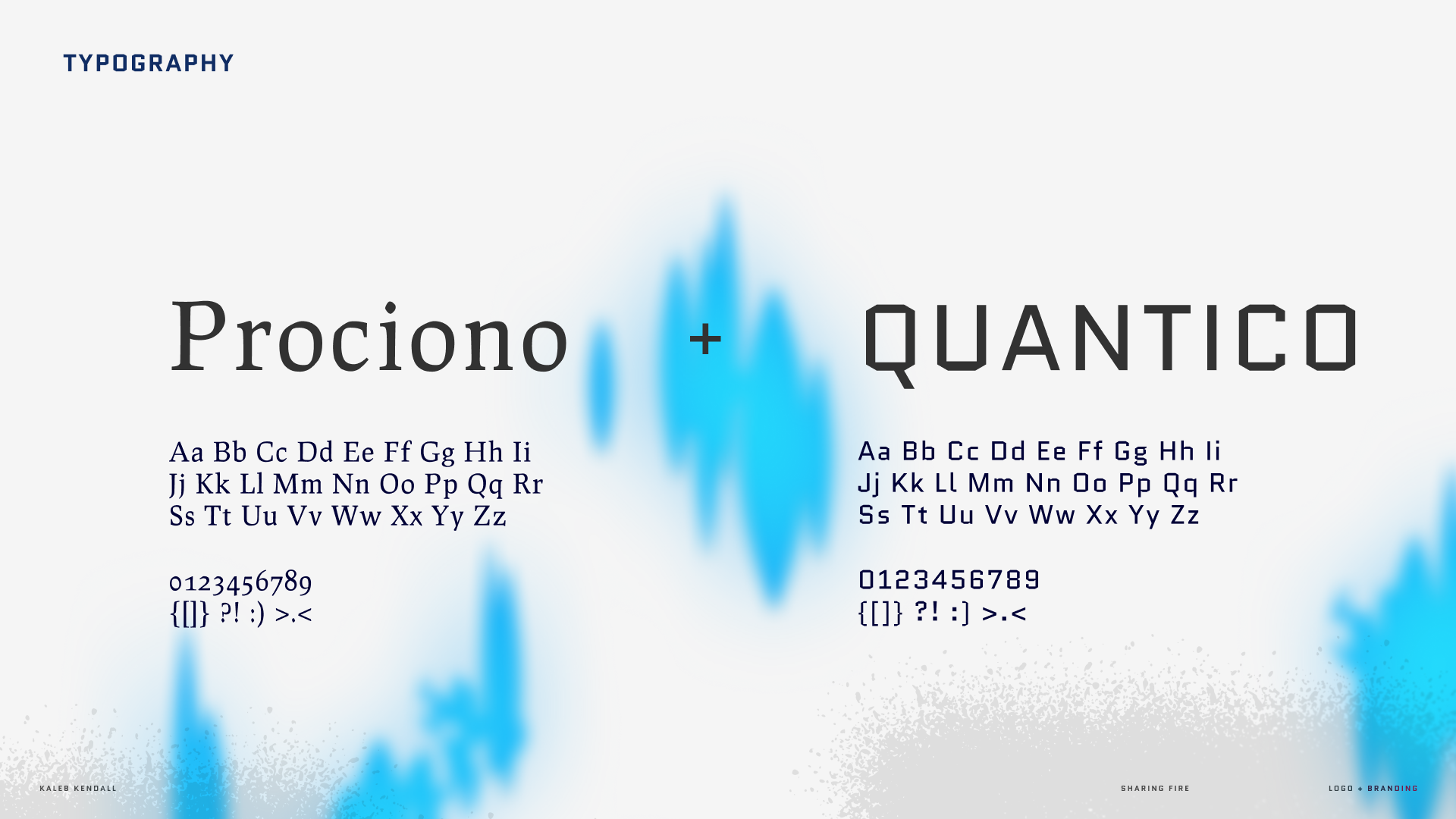
Instead of classic orange and red to represent fire, Sharing Fire is predominantly shown as blue, representing opposition (orange and blue are opposites on the color wheel), and a more intense, almost magical fire — the divine fire of Prometheus himself. Blue in this context represents energy, purity, enlightenment, and transformation, symbolizing efficient combustion, divine presence or spiritual maturity, and advanced technology. The type treatment mixes serif and sans-serif styles to bring both an academic and entertaining, movie-like appeal to the channel with its emphasis on immersive storytelling and thorough literary analysis.

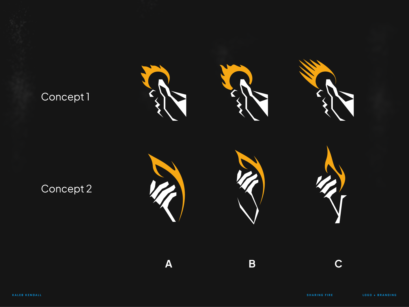
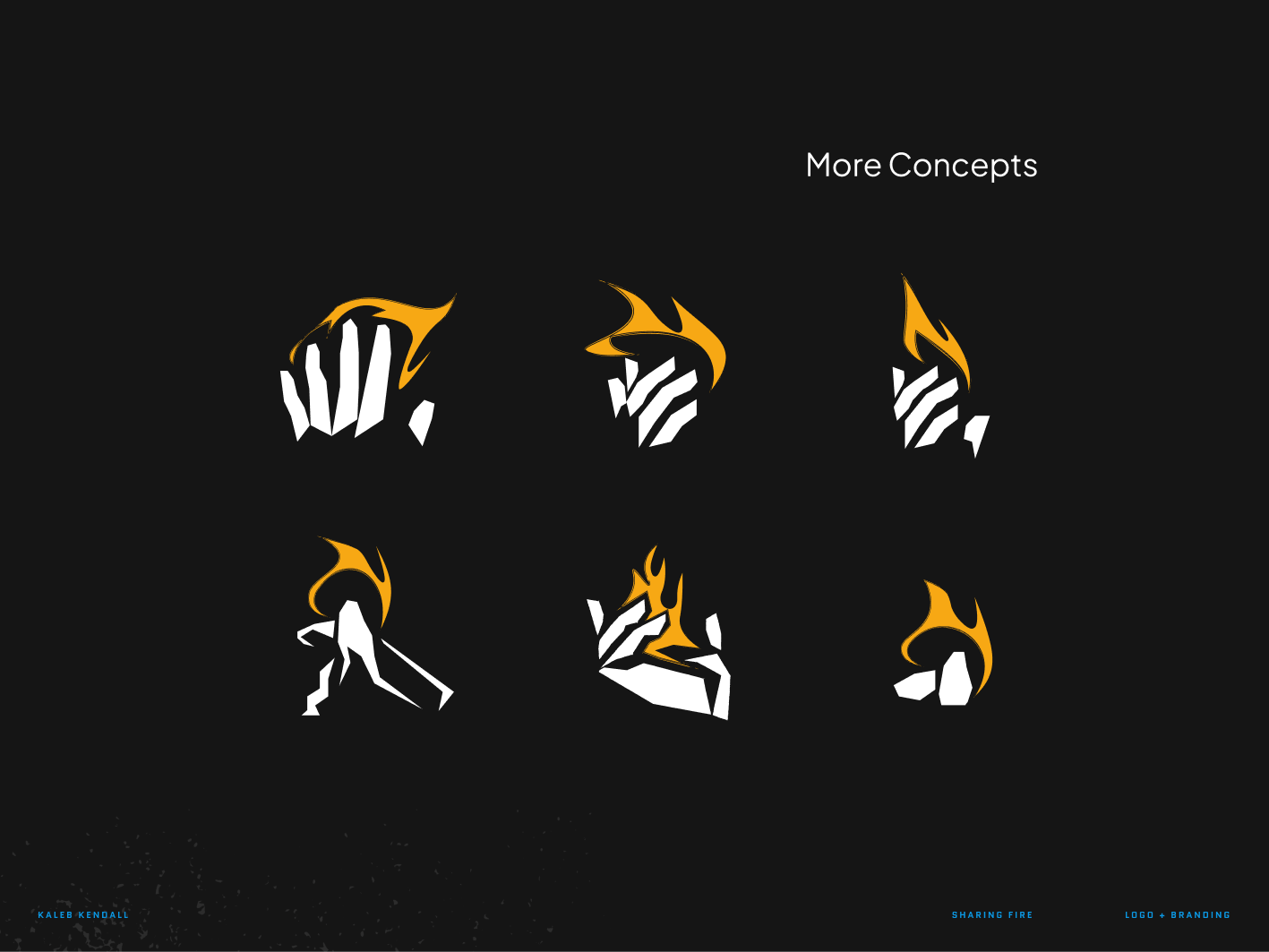
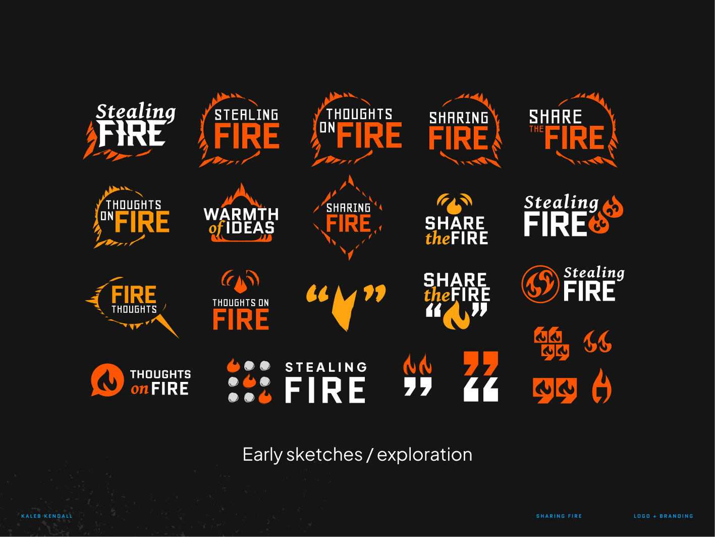
Preliminary iterations